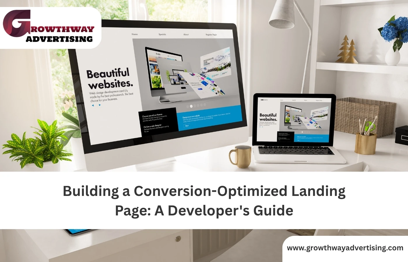
Let’s get something straight: a Landing Page is not just a web page. It’s a conversion engine. And it doesn’t matter whether you’re a developer, it is not only about neat code and a nice layout when it comes to making one that will convert. You are constructing a time of choice, the moment where a user flips the coin and becomes ready to be signed up as a user.
To make a Landing Page user-friendly, and not just functional, there are a set of details developers should be aware of to make the page successfully convert the visitor to a customer. We shall discuss what most books chat about and more importantly what they do not.
1. Start With Intent, Not Just Design
And before you load your IDE, this is what you need to comprehend; conversion occurs when there is a matching intention between what a user wants and what he or she sees on his or her page. All of it, UI Design, structure text, speed, all have to play together.
That means your Landing Page should:
- Speak directly to a single audience
- Offer a clear, desirable outcome
- Remove friction and distractions
- Make the next step obvious
When you are developing under such a company that develops websites, it needs to be part of the development process, not done like a bandaid.
2. Nail the Page Structure for Focus
A powerful Landing Page does not leave the users a choice. It provides them with guidance. That means:
- No full navigation bar (or at least a stripped-down version)
- No footer packed with links
- No sidebars or widgets
Instead, build around these core blocks:
- Headline & sub headline that lock into the user’s pain point
- Supporting text or video that builds trust
- Form or button with lead generation intent
- Social proof (testimonials, logos, stats)
- CTA (Call-to-Action) that’s clear and compelling
Stylists are not what developers should concern themselves with. Have the layout in modular sections where A/B testing and interchange of components can be done by marketers and designers.
3. Page Speed & Performance Still Rule
You may possess the most intelligent CTA and clean UI Design, but you can find yourself losing in 5 seconds when your page takes so long to load on the mobile.
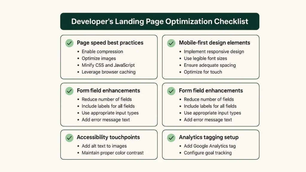
Prioritize performance:
- Lazy-load non-critical assets
- Make use of compressed next-gen picture files (WebP, AVIF)
- Reduce Third-party scripts
- Locally host fonts
If you’re offering web development services, this is non-negotiable. Trust = speed, or particularly on paid chatters. Bonus: Google pays attention as well. Assists in terms of Search Engine Optimization and Quality Scores.
4. Match Messaging With Traffic Source
This is where most developers end and where most marketers fail. You are not creating a Landing Page; you are creating several of them based on several results of a keyword research.
For example:
- A Google Ad user might land on a version with a clear headline based on their search intent.
- A Facebook user might hit a version that explains the product more visually.
There are, yes, duplicate pages in the codebase or CMS. However, tagging each of them with the traffic channel is an inroad to wiser optimization. And this is your advantage when you are developing a building with the website development organization.
5. Smart Forms, Not Long Ones
Formalities just murder the conversions. Even short forms may be an issue when they are clunky. As a programmer, you will have the chance to:you can:
- Use field autofill where possible
- Implement inline validation
- Enable progressive profiling (one step at a time)
- Trigger error messages instantly not after submit
In the case that your Landing Page is intended to generate leads, then form behavior is as important as form design. All the input fields are the possible points of dropout.
6. Accessibility Isn’t Optional
Most programmers do not pay attention to this, and you should not be one of them. As long as your Landing Page is not reachable, it is not optimized.
Checkpoints:
- Clear label associations
- Sufficient contrast ratios
- Keyboard navigation support
- ARIA roles where needed
- Error handling for screen readers
An optimal Landing Page has to suit every user. This is not puff, but it has an impact on actual business measures.
7. Prioritize Mobile UI Design Over Desktop
Mobile supplies more than 60 percent of traffic landing pages. Therefore do just the opposite to your workflow: mobile first develop and test. Do not do it as a retrofit-ization afterwards.
Your mobile UI Design should:
- Stack sections vertically
- Use large tap targets
- Keep CTAs visible (sticky footer buttons work)
- Avoid hover-based elements
That is where the skilled teams of good web development services come into their own. They do not only think about media queries, but also about breakpoints.
8. Integrate Analytics & Heatmap Tools Early
Many blogs refer to A/B testing, yet very little refers to the way the developers ought to arrange Landing Pages to render tracking successful.
Build with analytics in mind:
- Add event listeners to form fields and buttons
- Name elements and classes logically
- Use data attributes for dynamic tracking
- Place GTM/GA4 tags in the right context (above-the-fold interactions vs scroll depth)
Proper analytics configuration allows the marketing teams to do headlines, button, layout experimentation without the continuous need to reach out to the developers. That is the way to scale performance of a web development firm.
9. Inject Trust Using Microinteractions
It is considered that users do not read Landing Pages, they scan them. And they can pick on signals. Such things as smooth hover effects, input feedback, and scroll-based animations create subconscious credibility.
Examples:
- Show error validation in real-time
- Animate testimonials into view on scroll
- Gently highlight the CTA when the user pauses
With proper management, they enhance interaction without competition to the CTA. Taken to the extreme, they kill performance. Thus, balance UX with little JS and good timing.
10. Leverage SEO Without Compromising UX
Sure, you could optimize a Landing Page in regard to both conversions and Search Engine Optimization, but only in case you are purposeful.
Use keyword research to:
- Inform headline and subheadline
- Guide meta title and description
- Add relevant alt text to visuals
- Build structured schema (especially for services or FAQs)
Clarity should not be the loser to SEO. Do not use walls of texts. Just ranking should not be the goal of your headline to convert.
When you run a shop that is providing web design, to have this balancing baked into each one tells your clients that you understand both the technical and the marketing aspect of it.
11. Use Modular CSS for Easier A/B Testing
A real Landing Page undergoes tens of iterations- call to actions, layouts, sections are changed in and out each week.
This is done with modular CSS (BEM, Tailwind, or custom class-based systems) and fast. You simply interchange classes or parts as opposed to doing a whole new restyle.
This matters when:
- Testing two different offers with the same layout
- Swapping video for image hero
- Changing color themes based on campaign
The systems that web development services are based on such as this are faster, smarter in testing and iteration.
12. Track Micro-Conversions, Not Just Signups
You’re not just tracking final form submissions. Build in tracking for every small user action:
- Scroll % reached
- Hovered on the pricing table?
- Clicked to expand FAQ?
- Paused on video?
This allows groups to have early feedback about what is working. It also gives you the opportunity to optimize the Landing Page in terms of behavior (not only assumptions).
13. Smart Content Blocks for Dynamic Pages
Here is the one that is frequently overlooked: give content teams a chance to update the headlines, pictures, CTAs without rewriting the code
- Use CMS fields or no-code tools like Webflow or WordPress custom fields
- Implement smart shortcodes for CTA variants
- Enable section toggling (ex: testimonials on/off)
It is intelligent enough that you can stay up-to-date and relevant with campaigns, as a web design agency or an independent developer, without having to rebuild over and over again.
14. Don’t Just “Design” – Direct Attention
This is where UI Design goes tactical. You’re not just building a layout. You’re directing visual flow. Use tools like:
- Contrast to highlight important elements
- Whitespace to isolate key content
- Scroll animation to guide motion
- Visual cues (arrows, lines, shadows)
The conversion occurs when the users do not feel overwhelmed but in charge. That is what you are supposed to do as a dev.
FAQ’s
Because the way a page is constructed, its architecture, speed, responsivity, and UI Design does have a direct impact on converison. A great design will not convert if it is slow to load, or crap on smartphone.
Keyword research enables to make a page content relevant with user intent. It allows developers to organize URL paths, create SEO metadata and as well as to generate dynamically linked pages according to search queries.
The effective headline, CTA, short form, social evidence and visual hierarchy. All these have to be integrated to become a clean, mobile-compatible UI Design, which directs user attention.
Absolutely. Over 60% of users come via mobile. A Landing Page that isn’t mobile-optimized leads to poor engagement, high bounce rates, and lost leads.
Yes. Good web development services can audit, restructure, speed up, and integrate testing tools into existing pages improving conversion without full redesigns.