
Mobile users have high expectations. They desire ease of navigation, quick speed of loading stuff, clear graphics as well as layouts being well adjusted to their respective devices. To these developers, fulfilling those expectations is not about the code-it is about proper tools in design, test, and optimizing all details of the interface.
Whether you are designing websites on your own or heading your own dev teams, understanding what tools to use to design high fidelity prototypes, wireframes, animation, performance tests, and accessibility paving can all cut a difference. This guide will touch upon both the widely-discussed aspects of mobile UI optimization, and the minutia to get lost in that can differentiate your work.
1. Wireframing Tools for Solid Foundations
Visual polish is something to be achieved after structure. Wireframing tools provide you with a blue print of the mobile program or site that help you do not worry about colors and branding.
Popular picks include Figma, Sketch, and Adobe XD. These allow you to specify screen flows, navigation patterns as well as hierarchy. The important thing is to apply a tool that assists in implementing responsive design up front- otherwise you have to redo layouts down the road on tablets and smaller screens.
Pro tip: During the wireframe phase, do not worry about the aesthetics, the content should be logically grouped, touch targets should be intuitive, and constant scaling should exist within the spacing. And this guarantees a good base in terms of mobile usability, as well as future scaling.
2. High-Fidelity Prototypes for Real-World Simulation
Once the structure is ready, move into high-fidelity prototypes. They are not simply refined designs, it is rather an interactive simulation of the actual app. You could simulate transitions, gestures and micro-interactions with Framer, ProtoPie, or Figma built-in prototyping tools.
This step helps you:
- Validate design decisions before coding.
- Identify pain points in mobile usability.
- Share clickable demos with stakeholders or your website development company for feedback.
3. Responsive Design Testing Across Devices
Everybody talks about responsive design, but fewer actually subject their work to scrutiny on a wide range of screen sizes, pixel densities and orientations. Such tools as BrowserStack and Responsively App enable you to see the interface on various devices in real time.
Beyond just scaling, test:
- Breakpoints for layout shifts.
- Tap target sizes for different thumb reach.
- Responsive images that load the right size for each device, cutting unnecessary weight.
By incorporating these checks in the web design & development services process, it is possible to prevent complaints and performance decline after the launch.
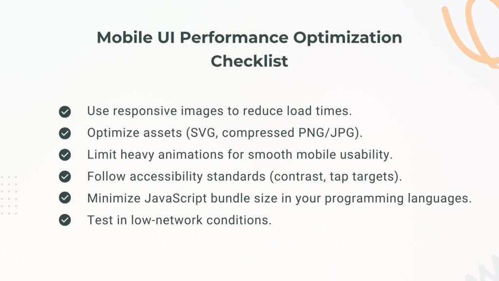
4. Asset Optimization and Responsive Images
In mobile UI, one of the largest performance bottle necks is images. Although you might have perfected the layout, picture loads can spoil the show, even in a case where images are loading at a slow pace. ImageOptim, TinyPNG or Squoosh are some of the tools capable of compressing with no apparent loss.
Combine that with:
- Responsive images in HTML (srcset and sizes attributes).
- Vector formats (SVG) for icons and illustrations.
- Lazy loading for below-the-fold visuals.
This should be automatic in a strong pipeline of website development services so that the load times remain fast.
5. Accessibility Testing Tools
It is here that most dev teams fail. Mobile usability is not just about a checked box of accessibility. Through utilities such as Axe DevTools, Lighthouse, and Stark, one can ensure that contrast ratios are being checked, keyboard navigation and compatibility with screen readers.
Focus on:
- Proper semantic markup in your chosen programming languages.
- Adequate color contrast for outdoor visibility.
- Voice navigation readiness.
Making such checks part of your web development services process means that your designs will serve everyone rather than just average users.
6. Performance Monitoring and Profiling
A mobile UI performance profiling toolset would not be complete without real-world profiling. Speed is an issue always discussed by designers, but developers require actual measurements. Use:
- Chrome DevTools for CPU, memory, and rendering performance.
- Lighthouse for performance scoring.
- Android Studio Profiler or Xcode Instruments for native apps.
It aims to identify any UI slowness due to large bundles, unoptimized animations, or redundant reflows-deal with them prior to delivery.
7. Cross-Platform Consistency Tools
It is not terribly uncommon to have designs that look good on iOS and/or Android, and it is definitely difficult when you want consistency between both. Design token lists and Style Dictionary allow consistency across platforms in regards to spacing, color, and typography.
Combining them with website design services with support of component libraries in backend frameworks, such as React native or Flutter, eludes weeks of redesign and avoids a design drift.
8. Animation and Micro-Interaction Tools
Choosing the right animations can break or make a mobile UI. When properly used, they lead to attention and better usability; when misused they bog everything. Applications such as Lottie, Rive, and Motion One simplify the process of lightweight animating that is optimized on mobile.
Use animations sparingly:
- Provide feedback (button presses, success states).
- Indicate transitions (navigating between screens).
- Avoid long or resource-heavy effects that slow down mobile usability.
9. Developer-Designer Handoff Tools
A repeating pain point on mobile UI projects has been the difference between designer to code. This gap can be closed with the help of such tools as Zeplin, Avocode, and the Inspect panel in Figma, providing developers with the opportunity to:
- Pull CSS values directly from designs.
- Export assets in correct formats.
- View spacing, typography, and interaction notes in one place.
When integrated into a website development company workflow, these tools reduce misinterpretations and shorten development cycles.
10. Accessibility Beyond Tools: Manual Testing
Automated accessibility software picks up on the blatant concerns, whereas manual validation would pass the test in the actual world. This includes:
- Testing in bright sunlight for visibility.
- Navigating entirely via keyboard or screen reader.
- Checking tap targets for users with limited dexterity.
It takes time so many teams that do website development services skip it, but you can use it to your advantage.
11. Code-Level Optimization with Programming Languages
Regardless of how fancy your design tools are, the end performance makes it to code. Write clean, modular, efficient code in the languages of your choice whether that be JavaScript in the case of web apps, or Swift/Kotlin in the case of native apps, Optimizing your programming languages code is all about optimizing your mobile UI.
Key tips:
- Avoid unnecessary DOM manipulations.
- Minimize JavaScript bundle sizes.
- Use CSS over JS for animations where possible.
- Take advantage of native APIs for smoother UI rendering.
12. Real-Device Usability Testing
Emulators are useful, but they can’t fully replicate the quirks of physical devices. Run your UI on bare metal-low-end Androids, older iPhones, tablets and even foldables. Pay attention to:
- Input lag.
- Frame drops during animations.
- Network throttling for slow connections.
A decent web design firm or web site development firm will have some sort of device lab or at least device rotation to make sure the experience holds up everywhere.
13. Tools for Continuous Improvement
Optimization of mobile UI does not represent an individual project. Include analytics and user feedback solutions such as Hotjar, FullStory, or Firebase Analytics so that you can track:
- Drop-off points.
- Confusing navigation flows.
- Laggy screens.
Doing this on a continuous basis must be included in the web development services package you offer-since good UIs grow to meet user needs and trends in devices.
14. The Overlooked Element: Cross-Network Performance
As much as the performance of the device is given attention, the network conditions may not be. You can emulate slow networks, or jittery networks (tools such as Charles Proxy or WebPageTest allow this) to make sure your mobile UI is going to react well to stress.
Combining these insights with caching, asset loading and service worker optimizations can have a significant effect on mobile usability in practice.
15. Design System Integration
Visual consistency, as well as acceleration of development, can occur as a result of a centralized design system. Implement tools with support of shared libraries and design tokens in order to make the updates automatically spread across projects. It is particularly useful to web design & development services operating on many apps or websites.
Why Covering the Gaps Matters
The majority of the guides revolve around wireframes, high-fidelity prototypes, and responsiveness design and rightly so. They make a good mobile UI solvent. However, it is the all-too-easy-to-overlook dimensions accessibility in real life, cross platform compatibility, network aware optimizations, and code level performance considerations where the optimal mobile experience is made.
When you work in a website development firm or operate your own website design services, incorporating these areas that many overlook into your usual step by step process does not only raise the outcomes but also turns your service into a competitive edge.
FAQ’s
Some of the most popular tools include Figma, Adobe XD, and Framer. They allow you to create interactive high-fidelity prototypes that simulate real app behavior for testing mobile usability before development begins.
Wireframing helps map the structure and navigation of a mobile app or site without visual distractions. It’s an essential step in web design & development services because it ensures logical flow and responsive design from the start.
Responsive design ensures that your UI adapts seamlessly to different screen sizes, orientations, and devices. A web design company that prioritizes responsive layouts improves accessibility, mobile usability, and overall performance.
Responsive images load the correct size for the user’s device, reducing load times and improving performance. This is a best practice in website development services to ensure smooth experiences on both high-end and low-end devices.
For native apps, Swift (iOS) and Kotlin (Android) are top choices. For cross-platform solutions, JavaScript with React Native or Dart with Flutter are popular. A skilled website development company will select programming languages based on your goals.
Mobile UI should be tested continuously. Using analytics and feedback tools, a web design company can identify usability issues and adjust responsive images, layouts, or programming languages to improve performance.


