
Here’s the thing: most business owners think a Mobile-ready website means their pages simply shrink on a phone. But Google and real customers look at something very different. They look at experience, speed, accessibility, searchability, and how naturally a user can move through your content with one hand. So when people ask whether their website is mobile-ready, the real question is whether it meets the standards that shape modern search and buyer behavior.
Let’s break it down in a way that covers what most guides already talk about, and more importantly, what they miss.
Why Google Cares So Much About Mobile-Readiness
Google relies heavily on Mobile-first indexing. This means it doesn’t judge your website based on how it looks on a laptop. It checks your mobile version first.
Slow loading mobile pages, failure to display correctly at various screen sizes, blocking of vital information and inability to navigate easily puts a dent in your rankings. It may make you have excellent campaigns, recruit the most qualified writers or even invest in advertisements, but none of it will work out unless you make your site to satisfy the needs of mobile crawlers.
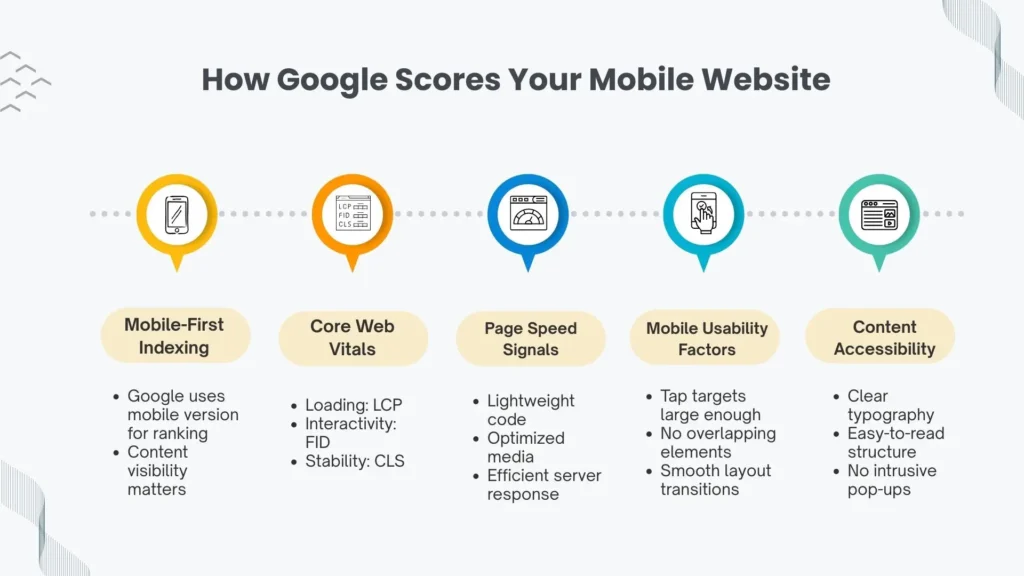
Google uses dozens of Google mobile ranking factors, but the most influential ones include:
- responsive web design
- clean structure and mobile-friendly layout
- fast loading speed backed by Core Web Vitals
- stable layout that doesn’t jump around
- accessibility and readable content
- optimized images and scripts
- easy navigation and intuitive taps
When your site respects these elements, you’re giving both Google and users fewer reasons to bounce.
Why Customers Care Even More Than Google
People spend most of their online time on mobile. They browse on the go, they search fast, they skim faster, and they make decisions in seconds. If your page loads slow or your buttons are tiny, frustration grows and they leave.
Buyers expect:
- clear, readable text
- distraction-free design
- navigation designed for one-hand usability
- quick access to the information they want
- smooth interactions on small screens
A strong mobile experience creates trust instantly. Users don’t consciously analyze it; they simply enjoy a website that feels built for them.
The Essentials Most People Already Know About Being Mobile-Ready
This part covers what many brands and guides mention, but still matters.
1. Responsive Layout That Adapts Naturally
A mobile-ready site should reshape itself automatically across screen sizes. This is where responsive web design plays the lead role. Flexible grids, adaptive typography, fluid images, and CSS rules allow your content to breathe on any device.
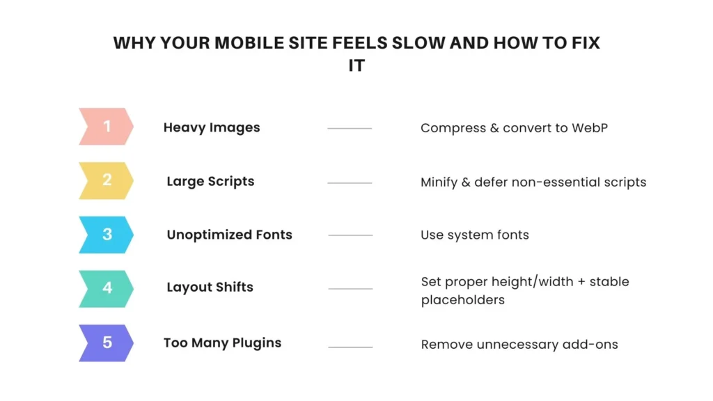
2. Fast Loading Backed by Performance Metrics
Your website isn’t mobile-ready until its metrics satisfy Core Web Vitals. Elements like Largest Contentful Paint, First Input Delay, and Cumulative Layout Shift guide how users experience your site.
Pair that with solid page speed optimization compressed images, minimized scripts, and caching and your site feels quicker and cleaner.
3. Easy-To-Read Content
Your body text should be readable without zooming in, your headings should be clear, and your spacing should feel comfortable. A good mobile UI design balances hierarchy with clarity.
4. Ensuring Accessibility
Buttons need to be large enough to tap, contrast should be high enough to read in sunlight, and form fields shouldn’t frustrate users.
These essential points matter, but they’re not enough anymore.
What Most Guides Miss About Mobile-Ready Websites
Here’s where things get interesting, this is the territory that many overlook, and where you can get ahead.
1. Real Mobile Behavior: One-Hand Patterns, Thumb Zones, and Scrolling Habits
Most sites are built for visual appeal. Few are built for actual behavior. People scroll with their thumbs, not their index fingers. They hold their phone from the bottom, not the center.
This is why one-hand usability is one of the strongest hidden UX signals.
Your menus, CTAs, search bar, and key links must fall inside natural thumb zones. If users stretch too much, they drop off.
2. Mobile Intent vs Desktop Intent
Mobile search intent is immediate. People search fast, scan fast, and expect answers even faster.
They care more about quick summaries, tap-friendly layouts, and intuitive flows.
Your content structure should reflect this:
- short paragraphs
- scannable bullets
- clear subheadings
- bite-sized insights
3. Mobile Conversion Optimization
This part is missing in most content. A mobile-ready site is not just visually responsive, it should convert.
Think:
- sticky CTA bar at the bottom
- clear value proposition above the fold
- fast-loading inquiry forms
- trust indicators that don’t clutter the screen
When your mobile layout is conversion-first, you turn visitors into leads instead of passive scrollers.
4. Real Mobile Testing, Not Just Simulator Tools
Checking your website in a browser’s mobile simulator isn’t enough.
People use mid-range devices with average processors, slow networks, and varying screen sizes.
You need testing across:
- older phones
- smaller screens
- average bandwidth
- multiple browsers
This reveals issues you’d never notice in a high-end simulator.
5. Mobile Voice Search Behavior
As voice interactions continue rising, optimizing for voice search on mobile matters. Users speak differently from how they type.
Voice queries are longer and more conversational. If your content answers questions naturally, you capture voice-driven traffic.
6. Mobile Search Snippets and Featured Answers
Mobile users often rely on rich snippets, FAQs, and quick summaries.
Optimizing headings, structured answers, and semantic keywords helps you show up higher.
How a Website Development Partner Helps You Get Mobile-Ready
If you work with a team that understands modern mobile behavior, it changes everything. A strong website development agency doesn’t just make your site responsive, they tailor your entire digital experience for mobile users.
A good partner offering website development services helps you with:
1. Technical Foundation
From layout control to efficient coding, they ensure your website ticks every performance and usability box that affects mobile SEO.
2. Real Device Testing
Instead of relying on assumptions, a skilled web development agency tests your website on multiple devices to check load times, scrolling strength, UI stability, and accessibility.
3. Mobile-First Architecture
This is more than design, it’s a strategy.
Your developer uses mobile as the starting point and scales up, instead of designing for desktop and shrinking things down.
4. On-Page Experience Optimization
Clean structure, readable content, optimized interactive elements, and smart navigation paths all add to mobile strength.
5. Performance Engineering
Developers fine-tune scripts, compress images, and reduce unnecessary code that slows down your site on mobile.
How to Know If Your Website Is Truly Mobile-Ready
Here are the signals that matter most:
1. Real-World Loading Speed
Not just lab metrics, your website should load fast even on weaker networks. Pages that pass Core Web Vitals typically feel smooth on real devices.
2. Navigation That Works Naturally
Menus should open easily, scroll should feel effortless, and content should be spaced for clarity.
3. Mobile-Specific SEO Strength
Your website should be aligned with Mobile-first indexing rules.
You should also address:
- mobile website optimization
- semantic markup
- readability
- stable layouts
- optimized images
4. Interaction and Conversion Flow
Look at your CTAs, form design, micro-copy, and checkout flow.
Ask: does this feel built for mobile behavior?
5. Voice-Friendly Content
Since many mobile searches use voice, content that aligns with natural speech patterns improves visibility for spoken queries.
What This Really Means for Your Visibility and Growth
The websites that win today don’t just look good, they respond intuitively, load instantly, and present information in a way that matches real human behavior on mobile devices.
When your site aligns with Google’s mobile expectations and customer behavior patterns, you build trust, improve rankings, and make your brand feel modern and reliable.
FAQ’s
A mobile-ready website adapts to different screen sizes, loads quickly on smartphones, and offers a smooth, user-friendly experience without zooming or complex navigation.
Google uses mobile-first indexing, which means it reviews your mobile site before the desktop version. A poor mobile experience can lower your visibility and ranking.
You can test your site using tools like Lighthouse, PageSpeed Insights, and real-device testing. Look for speed, layout stability, readability, and easy navigation.
Yes. Slow loading, poor UI, unstable layouts, and bad navigation directly impact rankings because they fall under Google’s mobile ranking factors and Core Web Vitals.
Mobile voice searches tend to be conversational. Content that answers questions clearly and naturally often performs better for voice-driven traffic.
Page speed is critical. Mobile users bounce fast if a site delays even a few seconds. Optimizing images, scripts, and server response improves mobile speed dramatically.


